By Ten Hoeve Advisory
Envision yourself stepping into a space where every wall seems to radiate warmth in the morning sun, each room feels uniquely inviting, and the entire home quietly tells your story. This isn’t accidental. The right paint colors do more than fill empty walls—they shape how you feel, how you live, and even how others experience your home.
In Rumson, NJ, where classic homes, sunlit living spaces, and water views set the stage, choosing the right paint tones is both an art and a science. Whether you’re settling into your dream house or preparing to redesign your residence, understanding the nuances of color selection empowers you to create spaces that feel welcoming, inspired, and completely your own.
Key Takeaways
- Paint choices transform not just the appearance but the energy and ambiance of every room.
- The light in your home—morning to evening—influences how colors are perceived.
- Recognizing undertones and color temperatures can help you avoid mistakes.
- The right palette complements both the architecture and natural surroundings.
- Sampling and observing colors in your own space leads to confident, beautiful results.
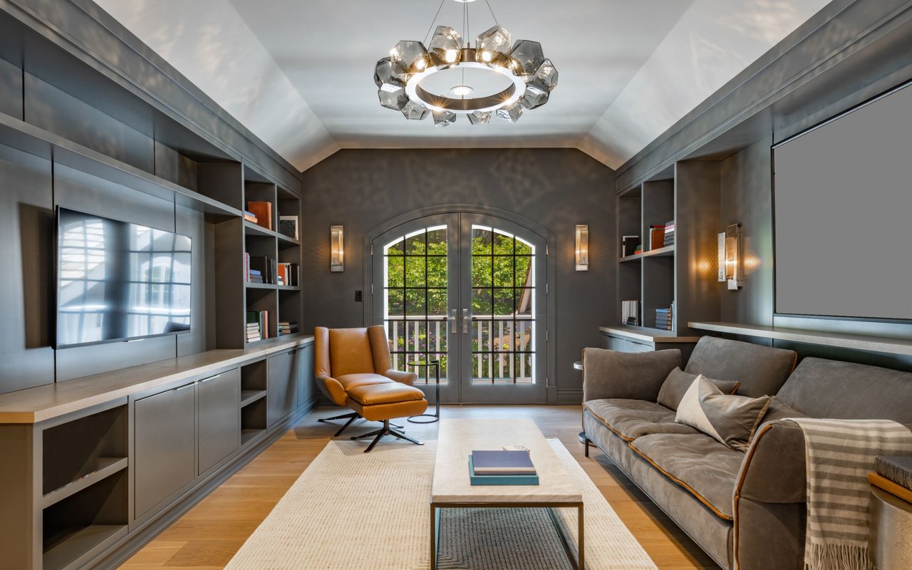
The Psychology of Paint: Setting the Tone in Every Room
Color is never neutral. It influences the energy you bring into your home, the setting of gatherings, and the comfort you feel when you finally unwind at night. In Rumson, with its blend of old-world elegance and fresh, modern interiors, choosing the right hues is your best bet for setting just the right tone.
Warm colors—think golden ochre, terracotta, and soft apricot—invite lively conversation in your dining room or a burst of energy in the kitchen. Cool tones, from tranquil seafoam to misty blue-gray, bring calm to bedrooms or a restorative ambiance to a spa-like bathroom. But it’s not just about the obvious emotional associations. Your own memories, preferences, and dreams matter just as much. A color that soothes one person may invigorate another.
Neutrals, the unsung heroes, provide a flexible backdrop for evolving styles, making it easy to refresh the décor as the trends shift. They’re the quiet confidence of a home that feels both current and timeless.
The Psychology of Color: Fast Facts
- Warm tones create inviting, sociable atmospheres in active spaces.
- Cool shades encourage relaxation and renewal—perfect for restful rooms.
- Neutrals offer longevity and flexibility for your evolving taste.
- Your personal associations with colors matter just as much as design theory.
Decoding Undertones and the Magic of Color Temperature
Have you ever chosen a “simple” gray or white paint, only to discover that it suddenly looks blue, pink, or even green in your home? That’s the subtle but mighty influence of undertones. When you shop for paint, two colors may look nearly identical on a swatch, but those hidden undertones can completely transform their impact in your space.
In Rumson homes, abundant natural light brings undertones to life. A beige that reads creamy in the store may lean yellow or blush at home. Cool undertones—blues, greens, or purples—can make a room feel serene or, if chosen poorly, cold and unwelcoming. Warm undertones add comfort but might appear muddy if paired with incompatible lighting.
Understanding color temperature is equally crucial. Warm hues feel cozy and intimate, while cool tones open up a space and add a breath of fresh air. The effect is amplified or softened depending on your room’s size, the direction it faces, and even the textures of your furnishings.
Undertones and Temperature Tips
- Always view paint samples on your own walls at different times of day.
- Match undertones for a harmonious flow (cool with cool, warm with warm).
- In open-concept homes, undertones can shift dramatically between rooms.
- Observe how paint interacts with your existing flooring, fabrics, and art.
Letting Light Guide Your Paint Choices
Natural light is a designer in its own right—revealing, shifting, and even transforming your chosen paint throughout the day. In Rumson, where homes are often bathed in golden coastal light or dappled shade from mature trees, understanding the impact of natural lighting is a must.
North-facing rooms tend to feel cooler and shadowed, so embrace warm, creamy shades to counteract any chill. South-facing spaces soak up the sunlight, making deeper colors appear vibrant and energizing. East-facing rooms welcome the day with gentle brightness, while west-facing rooms turn golden and dramatic as evening approaches.
Artificial lighting also plays a role. Bulb type, wattage, and fixture style all affect color, and the paint finish, whether matte or glossy, changes the way light dances across different surfaces.
Light and Color Cheat Sheet
- Test paints on each wall to see how light transforms them, morning to night.
- Choose warmer colors for north-facing spaces and bold hues for sunny south-facing rooms.
- The sheen of your paint affects both appearance and maintenance.
- Layering lighting (overhead, lamps, sconces) offers more control over your paint’s impact.
Painting for Character: Enhancing Rumson’s Distinctive Homes
Rumson’s architectural legacy calls for colors that honor the past while welcoming the present. Many homes feature classic lines, generous porches, and water-facing windows—a canvas just waiting for the right paint palette.
Timeless exteriors shine in shades like soft cream, weathered gray, and gentle taupe, letting the home’s character and lush landscape take center stage. Inside, you might lean into serene greens, ocean-inspired blues, or warm linen whites—each tone echoing the natural beauty right outside your door.
Don’t shy away from deeper accent colors on doors, shutters, or built-ins. A navy or hunter green can add gravitas, while a soft blue ceiling brings a breath of sky indoors.
Rumson’s Signature Color Strategies
- Classic homes look refreshed in soft neutrals and nature-inspired shades.
- Accent colors on doors and trim express individuality and charm.
- Interior colors that reflect the great outdoors enhance connection and tranquility.
- Layered palettes help new additions blend seamlessly with original structures.
A Thoughtful Color Plan
A truly inviting home doesn’t just feel comfortable in individual rooms—it flows effortlessly, guiding you from one space to the next. Creating cohesion means thinking beyond single walls to see the whole house as a composition.
Start with a shade you love and want to echo throughout the home. Then, layer in lighter or deeper tones for variety, using accent colors on architectural details or in secondary spaces. Hallways, stairwells, and trim become natural connectors. Consistency in finish and undertones makes everything feel intentional. This approach makes sure that every room feels unique yet part of a bigger story, so you always feel at ease.
Start with a shade you love and want to echo throughout the home. Then, layer in lighter or deeper tones for variety, using accent colors on architectural details or in secondary spaces. Hallways, stairwells, and trim become natural connectors. Consistency in finish and undertones makes everything feel intentional. This approach makes sure that every room feels unique yet part of a bigger story, so you always feel at ease.
How to Build a Cohesive Palette
- Identify a base color to repeat in key areas (hallways, open living spaces).
- Use lighter or darker versions in adjoining rooms for subtle shifts.
- Repeat accent colors on doors, trim, or built-ins for a sense of rhythm.
- Carry finishes (matte, satin) throughout for visual harmony.
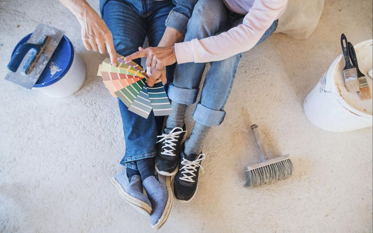
How to Test and Select Paint Colors
The secret to loving your finished walls? Test, test, test. Narrow down your favorites, then get sample pots. Paint generous swatches in every room and on every wall you’re considering. Watch how each color changes with the shifting light.
Check the samples with your furnishings, flooring, and art. Notice how they feel in the morning, at midday, and after sunset. It may take a few days, but you’ll gain the confidence that comes from real experience, not just a paint chip or a designer’s suggestion. And remember: trust your instincts. The “right” color is the one you’ll love to see every day.
Check the samples with your furnishings, flooring, and art. Notice how they feel in the morning, at midday, and after sunset. It may take a few days, but you’ll gain the confidence that comes from real experience, not just a paint chip or a designer’s suggestion. And remember: trust your instincts. The “right” color is the one you’ll love to see every day.
Steps for Color Confidence
- Start with a few top picks, and sample them in each room.
- Observe each sample in natural and artificial light, at all hours.
- Place swatches near your furniture and décor to check compatibility.
FAQs
How Can I Choose Paint Colors That Feel Right for My Rumson Home?
Think about the feeling you want to create in each room, how much light the space receives, and the style of your home. Always test paint samples in your actual rooms before making a final choice.
Why Do My Paint Colors Look So Different on the Wall?
Lighting, undertones, and even the paint finish will affect how a color appears in your home. Colors can look totally different in natural versus artificial light, and the same shade may shift dramatically from room to room.
Which Paint Colors Work Best With Rumson’s Classic Homes?
Soft whites, muted blues, warm grays, and nature-inspired greens are timeless choices. These shades emphasize architectural details and harmonize beautifully with the area’s landscape.
Should I Use Different Paint Finishes in Different Rooms?
Yes. High-traffic and moisture-prone areas benefit from satin or semi-gloss for easier maintenance, while living rooms and bedrooms often look great in matte or eggshell finishes.
Ready for Expert Real Estate Guidance in Rumson?
Choosing paint is more than a final detail; it’s a creative process that sets the tone for every experience in your Rumson home. With a thoughtful, science-backed approach, you can craft a space that feels authentically yours and beautifully balanced, every hour of every day.
Navigating the world of paint colors is just the beginning. If you’re considering a move, looking to maximize your home’s value, or seeking that next dream property in Rumson, our team at Ten Hoeve Advisory is here to guide you every step of the way.
Navigating the world of paint colors is just the beginning. If you’re considering a move, looking to maximize your home’s value, or seeking that next dream property in Rumson, our team at Ten Hoeve Advisory is here to guide you every step of the way.